Fewer, better junctions
Alignments, edges and transitions are part of the design. The place where two materials meet deserves as much thought as either surface.
Materials & craftsmanship
A small palette leaves room for texture, light and proportion to do their work. We choose materials for how they feel today, and how they might become part of your life over time.
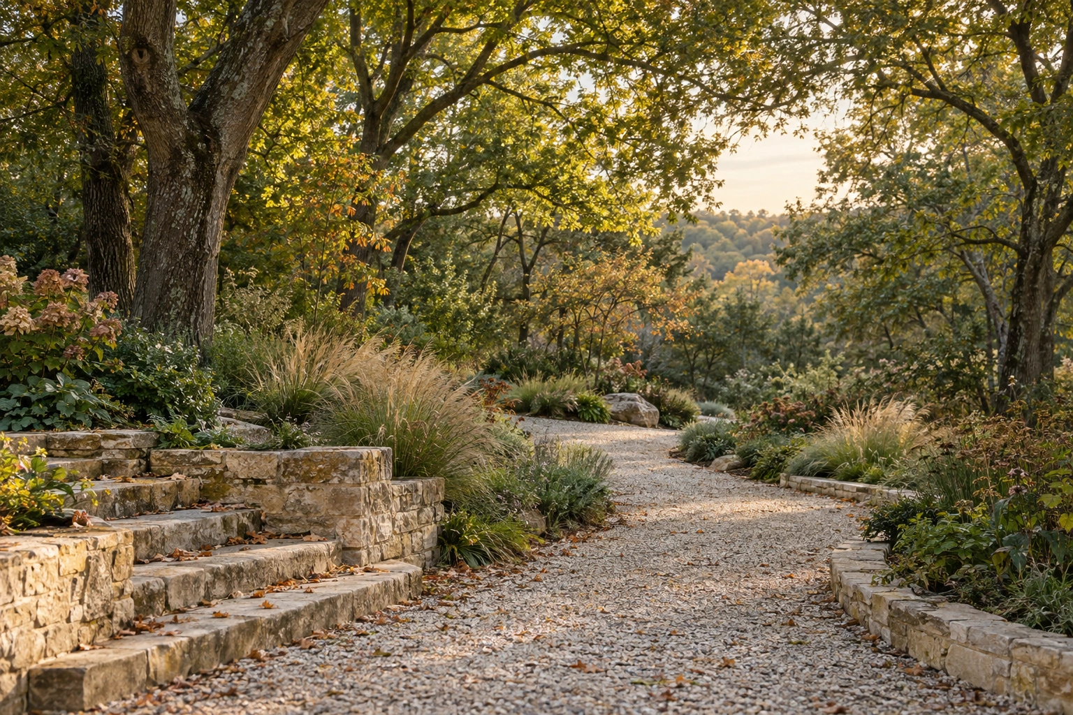
A palette in three dimensions
Scroll from a close material detail to the complete home. Compare warm limestone, smoked oak and pale mineral below, then try your preferred finish in the Design Studio.
Choose your material palette →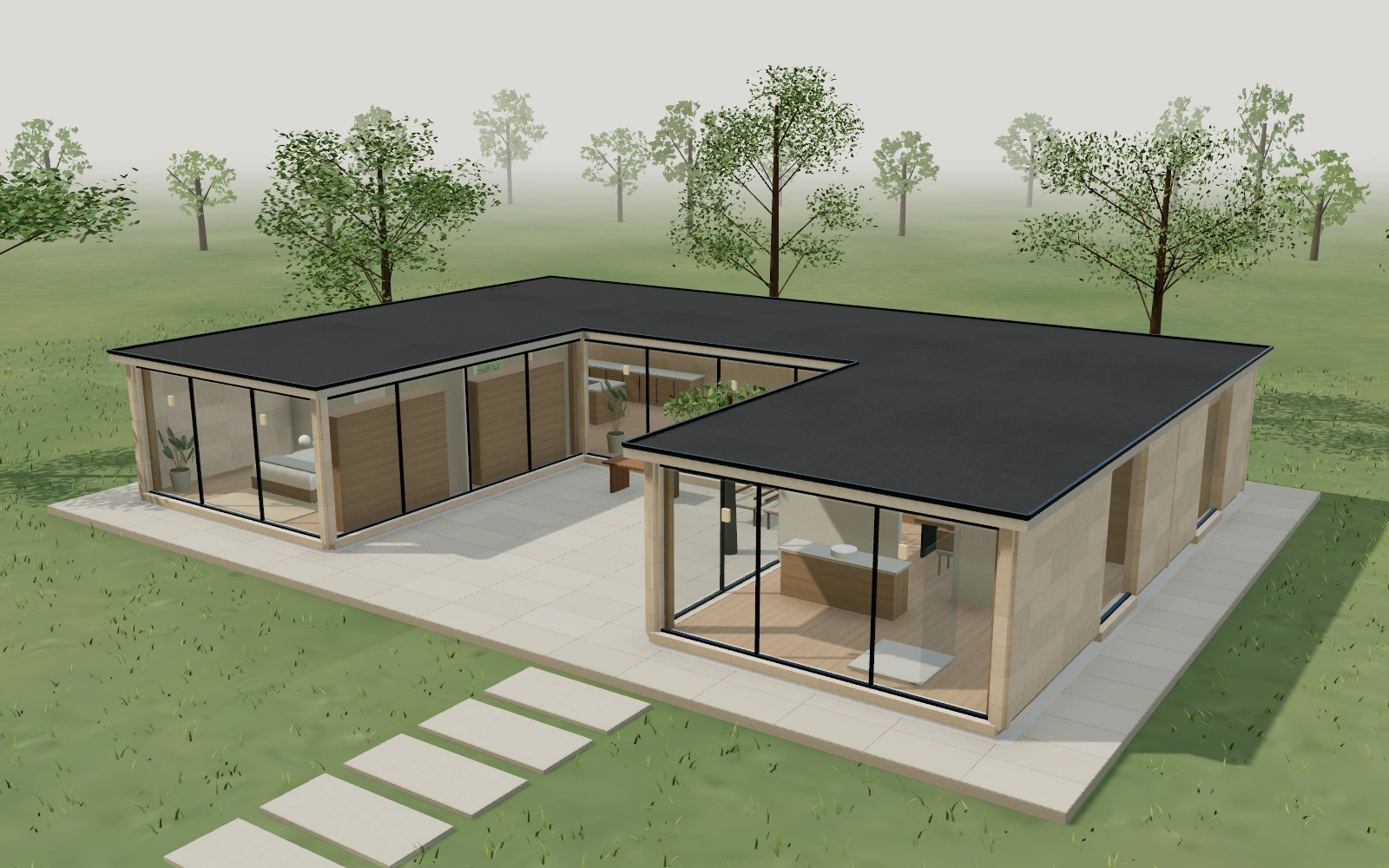
Loading architectural study
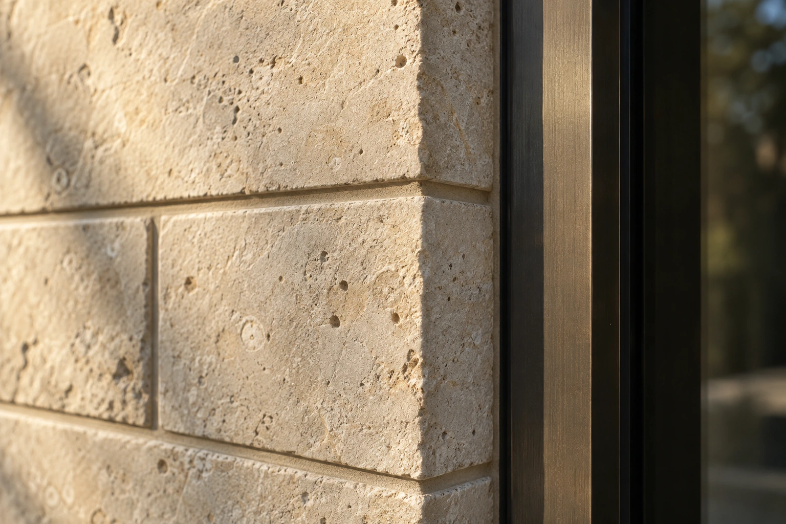
01 / Warm limestone
Subtle texture and a warm, grounded tone give this palette its calm character. It sits easily against planted courtyards and warm interior light.
Our starting palette pairs the stone concept with pale internal surfaces, warm joinery and understated metalwork.
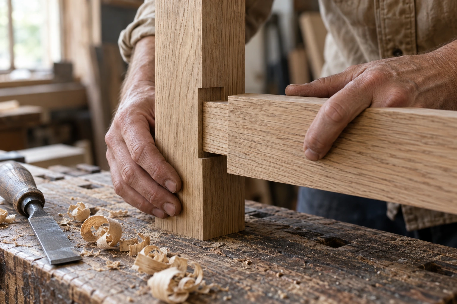
02 / Smoked oak
Deep timber tones bring a more intimate feeling to the architecture. The grain gives large planes a quiet rhythm and rewards a closer look.
Use the Design Studio to see the palette across the whole home, then consider where its warmth matters most to you.
03 / Pale mineral
A restrained pale exterior makes shadows, planting and the changing sky part of the composition. The atmosphere is bright, calm and deliberately simple.
Concept allowance: $28,000 before tier adjustments.
Explore the palette in the studio →How we think about making
Alignments, edges and transitions are part of the design. The place where two materials meet deserves as much thought as either surface.
Exposure, maintenance and the demands of everyday life guide what goes where. A beautiful finish still needs to be appropriate for its setting.
The exterior, interior and landscape should feel related. A consistent material language creates that connection without making every room the same.
Materials shown are conceptual. Exact products, performance, sourcing and maintenance requirements would be confirmed during a real design and specification process.
Your next chapter
Explore the materials on your chosen home. Save the combination that feels right.
Open the Design Studio